Ranking the 13 wildest kits in Super League history with Leigh in top five TWICE

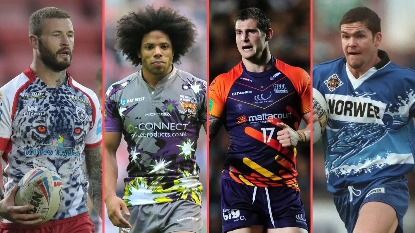
From left to right: Leigh Leopards' 2023 home kit, Huddersfield Giants' 2012 away kit, Widnes Vikings' 2013 away kit and Wigan's 1997 away kit
It’s that time of the year when clubs start releasing their kits ahead of the new season. Excitement over the new threads is always rife, but over the years, we’ve seen some absolute wild ones.
Below, we’ve taken a look at 13 absolute howlers from the Super League era, with the caveat being that we’ve tried not to include charity kits as they’re all for a good cause.
Inspired by Leigh Leopards’ latest release, their red and white leopard print home kit for 2025, here is the list without further release.
We’ve taken a look at them and ranked them – from the mildest to the absolute standout most outrageous and, to be frank, wildest kits you’re ever likely to see…
13. Wigan Warriors (H) – 2011

‘Wigan starts with a W, so stick a big one on a plain blue shirt and have done with it’. We imagine that’s how the design talks for this shirt went. The Warriors won the Grand Final this year though, so they had the last laugh.
12. Wigan Warriors (Third) – 2016

The aircraft marshallers at Manchester Airport are after their hi-vis back. Nowhere near as bad as the others in this list, but just very luminous. Like marmite, we guess.
11. Sheffield Eagles (H) – 1996

No, it’s not North Macedonia’s national football team. It’s Sheffield and that is an Eagle.
10. Leeds Rhinos (Third) – 2023

If you look at this from far enough away, it actually looks decent. But close up, the design is an utter madness. The Rhinos said it had been inspired by the culture of their city as part of Leeds’ Year of Culture, but there is no excuse.
9. Sheffield Eagles (A) – 1996

Nowhere near as bad as the home kit, but still absolutely wild. Your name is Sheffield EAGLES, we get it. Made famous, of course – as any 90s film buff will remember – from The Full Monty. Not for its eye-catching beauty.
8. Wigan (A) – 1997

‘Whoosh’. What else do you say? It’s as if someone’s dethroned Neil Buchanan as the host of Art Attack and chucked a load of paint on some fabric.
7. Widnes Vikings (A) – 2013

From what we understand, Widnes were trying to match the colour scheme of shirt sponsors ‘maltacourt’ here. We get that, but it is still an absolute kit crime. If you removed the lines that are coming from the bottom right, it would probably have been a lot better.
6. Hull Sharks – 1997

We’ve tweaked the rules ever so slightly, just for this one, forgive us. Hull were in the second tier in 1997, but we had to show you this absolute abomination. That’s the first and last rule break, we promise.
5. Leigh Leopards (H) – 2025

The kit which inspired this article. It certainly caught the attention of the rugby league public on socials and sparked debate. Whether we’ll grow to love it, as we have some of their other kits in recent years, we’re not quite sure yet. It’s either outstanding, or quite the opposite, we’re undecided.
4. Leigh Leopards (H) – 2023

Leigh had already created a stir with their name change, and then announced this as their first kit under the ‘Leopards’ tagline, but it proved to be a marketing masterclass. The shirt never got any better, but Adrian Lam’s side took Super League by storm and gave people more to talk about on the field than off it.
3. Castleford Tigers (A) – 1997

Animals on kits were obviously the rage of the early Super League seasons, as you can see. TIGERS!
2. Huddersfield Giants (A) – 2012

We can’t decide whether we love or hate this. It seems Kooga went from ‘do the bare minimum’ to ‘leather everything possible on a shirt’ in the space of a few years when they dreamed up this Huddersfield shirt.
1. Hull Sharks (A) – 1998

Our eyes. It’s no wonder the ‘Sharks’ experiment didn’t last long up at Hull, is it?
READ NEXT: The Super League table since Matt Peet took charge at Wigan Warriors


