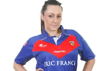
Super League 2012 Kits

We run down your club’s new look ahead of the 2012 Super League season.
Bradford Bulls
The Bradford kit for 2012 pretty much sticks to the traditional design with the red, yellow and black design. Good shirt design if not slightly boring. 7/10
Castleford Tigers
Castleford have stuck with their normal choice of yellow for this year’s home shirt which features a new sponsor. The shirt has a bold black and white chevron rather than the thin stripes from last season’s shirt. The bright blue sponsor logo in the middle looks slightly odd, but a decent shirt for the Tigers. 8/10
Catalan Dragons
The Dragons have released a new home, away and 3rd kit for use in the Challenge Cup. The home kit sticks with the white base and red and yellow chevron shape, the away shirt is almost an inverted version of the home with the 3rd kit a striped kit. The away shirt could be better but the home and 3rd kits look good. 7/10
Huddersfield Giants
The Giants kit features the traditional colours of maroon and gold. This year’s kit looks like a much more fitted shirt and has much smaller gold stripes than previous years. Overall, it looks a smart kit and has that something different by keeping with their traditional maroon. 9/10
Hull FC
The Hull FC home kit is a pretty standard shirt for FC keeping with the tradition black and white irregular stripe design. The away kit is much more interesting this year, stepping away from the pale blue design seen in previous years the kit is darker and looks very smart, definitely the better of the two. 8/10
Hull KR
The home kit is a much more simple design than previous year’s kits and features a lot less red. The simple design is echoed with the away shirt which seems to be a lighter shade of blue than last year’s. Overall a decent kit but the away kit looks a little like a football shirt! 6/10
Leeds Rhinos
The Leeds kit looks slightly darker than their usual efforts but sticks with the traditional yellow and blue. The shirt looks like a fitted design which many clubs including Leeds have opted for in recent years. 9/10
London Broncos
A big difference this year for London. Having scrapped the ‘Harlequins’ name, London have gone for a complete change from the old ‘large checked’ design to a very plain, rather boring kit. Both shirts are blue, one dark and one pale and look a little too much like t-shirts without that middle-of-the-shirt sponsor. Pretty boring and quite bizarre. 4/10
Salford City Reds
The Salford kit is a really smart effort. Sponsored by Media City the kit looks pretty impressive. Sticking with red and white the detail of the shirt is good and not too boring. Definitely one of the better efforts. 9/10
St Helens
Saints keep the red and white chevron design on this year’s home shirt, making it fairly similar to the last few season’s efforts. It’s a pretty simple, smart design and overall an 8/10
Wakefield Wildcats
The Wakefield kits are again quite similar to previous years featuring the normal white, red and blue colours. The away kit is slightly more interesting than the home but nothing too out of the ordinary for the Wildcats. 7/10
Warrington Wolves
The Wolves have stuck with their Primrose and Blue design for the home shirt but have stepped away from last year’s striped design in favour of a much simpler shirt. The club have stuck with the stripes for the away shirt which features the more out-of-the-ordinary colours of red and black. 7/10
Widnes Vikings
The Super League newcomers have gone for a traditional design of a black and white shirt featuring a chevron shape. The shirt boasts some modern technology featuring a QR code which can be scanned using a smart phone and opens the Widnes Vikings Official Website on the device’s browser. Pretty impressive and a smart looking shirt. 9/10
Wigan Warriors
The home kit is a very traditional design and goes back to the instantly recognisable cherry and white hoops of the Warriors. The away shirt is quite a change for Wigan, described on the official website as black and gold. Might be the kind of kit which is easier to judge when the actual photographs are released, rather than the digital impression, but overall a smart looking kit. 7/10
Which kit is your favourite? Let us know below.